
变换效果
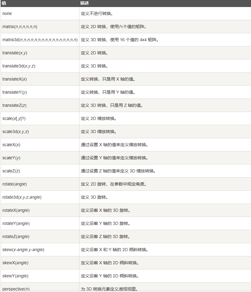
transform 属性
CSS transform 属性允许你旋转、缩放、倾斜或平移给定元素。这是通过修改 CSS 视觉格式化模型的坐标空间实现的。
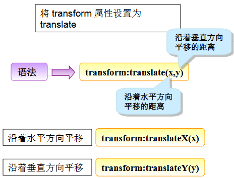
定义 2D 平移
代码示例
<style>
.demo{
background-color: #0000FF;
width: 200px;
height: 50px;
line-height:50px;
color: #FFFFFF;
text-align:center;
transform: translate(100px,50px);
}
</style>
<div
class="demo"> 敏而好学,不耻下问。 </div>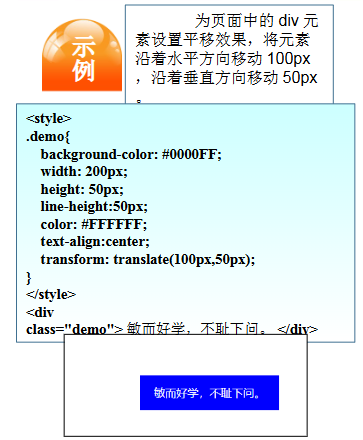
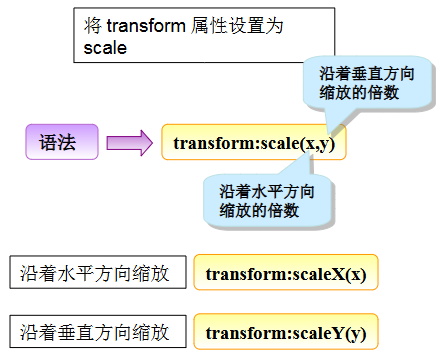
定义 2D 缩放
代码示例
<style>
.demo{
margin: 50px auto;
background-color: #0000FF;
width: 200px;
height: 50px;
line-height:50px;
color: #FFFFFF;
text-align:center;
transform: scale(2,2);
}
</style>
<div
class="demo"> 敏而好学,不耻下问。 </div>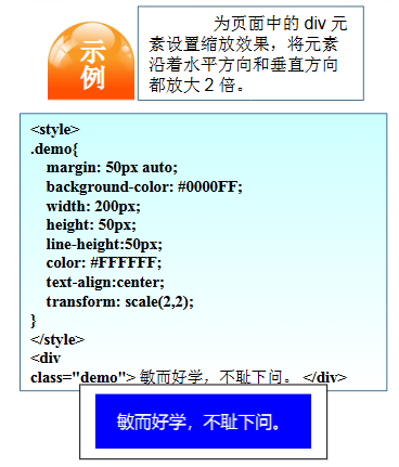
定义 2D 旋转
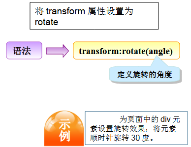
代码示例
<style>
.demo{
margin: 100px;
background-color: #0000FF;
width: 200px;
height: 50px;
line-height:50px;
color: #FFFFFF;
text-align:center;
transform: rotate(30deg);
}
</style>
<div
class="demo"> 敏而好学,不耻下问。 </div>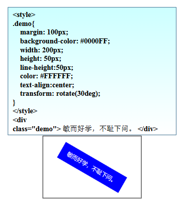
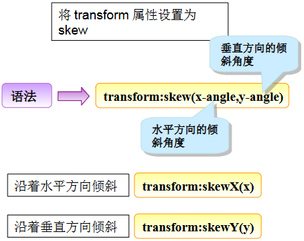
定义 2D 倾斜
代码示例
<style>
.demo{
margin: 100px;
background-color: #0000FF;
width: 200px;
height: 50px;
line-height:50px;
color: #FFFFFF;
text-align:center;
transform: skew(30deg);
}
</style>
<div
class="demo"> 敏而好学,不耻下问。 </div>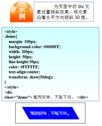
过渡效果
指定过渡属性
transition-property 属性
transition-property 是 CSS3 中用来指定过渡效果应用到哪些 CSS 属性上的属性。它允许你明确指定要过渡的属性,从而在元素状态发生改变时仅对指定的属性应用过渡效果,而不是对所有属性都应用过渡效果。
该属性的值可以是 CSS 属性的名称,也可以是关键字 all,表示对所有属性应用过渡效果。
例如,如果你只想在颜色发生变化时应用过渡效果,可以这样写:
代码示例
<style>
div
{
	width:100px;
	height:100px;
	background:red;
	transition-property: all;

}
div:hover
{
	width:300px;
}
</style>

<div></div>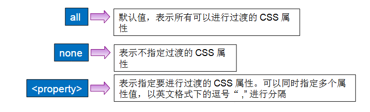
指定过渡时间
transition-duration 属性
transition-duration 是 CSS3 中用来指定过渡效果持续时间的属性。它定义了过渡效果从开始到结束所花费的时间长度,可以使过渡效果更加平滑和自然。
该属性的值可以是秒(s)或毫秒(ms),表示过渡效果的持续时间。可以使用小数值来定义更精确的持续时间。
例如,如果你想让过渡效果持续 1 秒钟,可以这样写:
代码示例
<style>
.demo{
margin: 150px;
background-color: #0000FF;
width: 150px;
height: 50px;
line-height:50px;
color: #FFFFFF;
text-align:center;
transition-property:width,height;
transition-duration:2s;
}
.demo:hover{
width:300px;
height:100px;
line-height:100px;
}
</style>
<div class="demo"> 有志者事竟成 </div>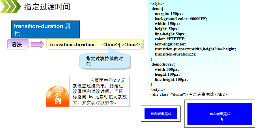
指定过渡的延迟时间
transition-delay 属性
transition-delay 是 CSS3 中用来指定过渡效果延迟开始的时间的属性。它定义了在元素状态发生改变后,过渡效果开始应用的延迟时间,从而允许你控制过渡效果何时开始执行。
该属性的值可以是秒(s)或毫秒(ms),表示过渡效果的延迟时间。
代码示例
<style>
.demo{
margin: 150px;
background-color: #0000FF;
width: 150px;
height: 50px;
line-height:50px;
color: #FFFFFF;
text-align:center;
transition-property:width,height,line-height;
transition-duration:2s;
transition-delay:1s;
}
.demo:hover{
width:300px;
height:100px;
line-height:100px;
}
</style>
<div class="demo"> 有志者事竟成 </div>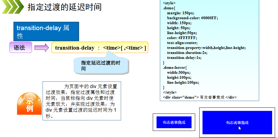
指定过渡的动画类型
transition-timing-function 属性
transition-timing-function 属性规定过渡效果的速度曲线。
该属性允许过渡效果随着时间来改变其速度。
代码示例
<style>
div
{
	width:100px;
	height:100px;
	background:red;
	transition:width 2s;
	transition-timing-function:linear;
	/* Safari */
	-webkit-transition:width 2s;
	-webkit-transition-timing-function:linear;
}

div:hover
{
	width:300px;
}
</style>
<div></div>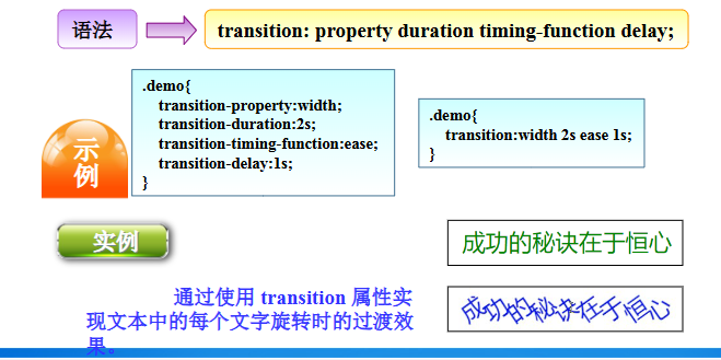
动画效果
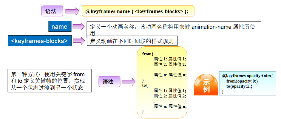
关键帧
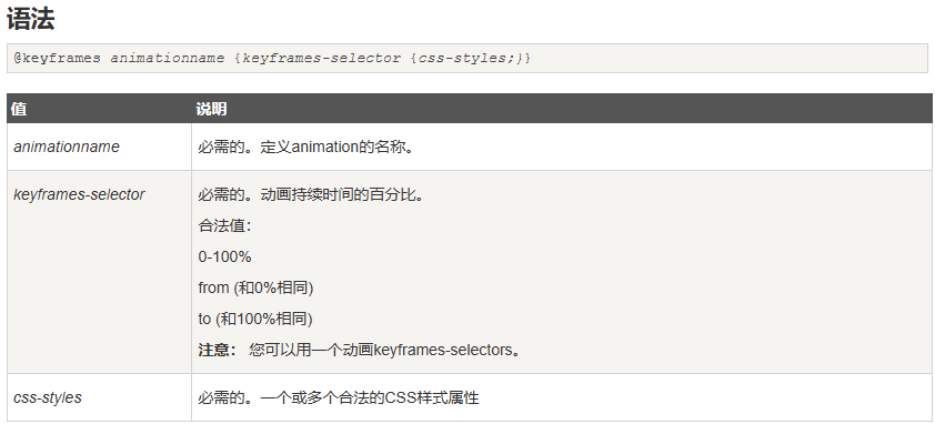
@keyframes name { <keyframes-blocks> };
使用@keyframes规则,你可以创建动画。
创建动画是通过逐步改变从一个CSS样式设定到另一个。
在动画过程中,您可以更改CSS样式的设定多次。
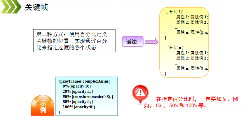
指定的变化时发生时使用%,或关键字”from”和”to”,这是和0%到100%相同。
0%是开头动画,100%是当动画完成。
为了获得最佳的浏览器支持,您应该始终定义为0%和100%的选择器。
注意: 使用animation属性来控制动画的外观,还使用选择器绑定动画。.
代码示例
<style>
div
{
	width:100px;
	height:100px;
	background:red;
	position:relative;
	animation:mymove 5s infinite;
	-webkit-animation:mymove 5s infinite; /* Safari and Chrome */
}

@keyframes mymove
{
	from {top:0px;}
	to {top:200px;}
}

@-webkit-keyframes mymove /* Safari and Chrome */
{
	from {top:0px;}
	to {top:200px;}
}
</style>

<div></div>